matplotlib: how to prevent x-axis labels from overlapping
I’m generating a bar-chart with matplotlib. It all works well but I can’t figure out how to prevent the labels of the x-axis from overlapping each other. Here an example:
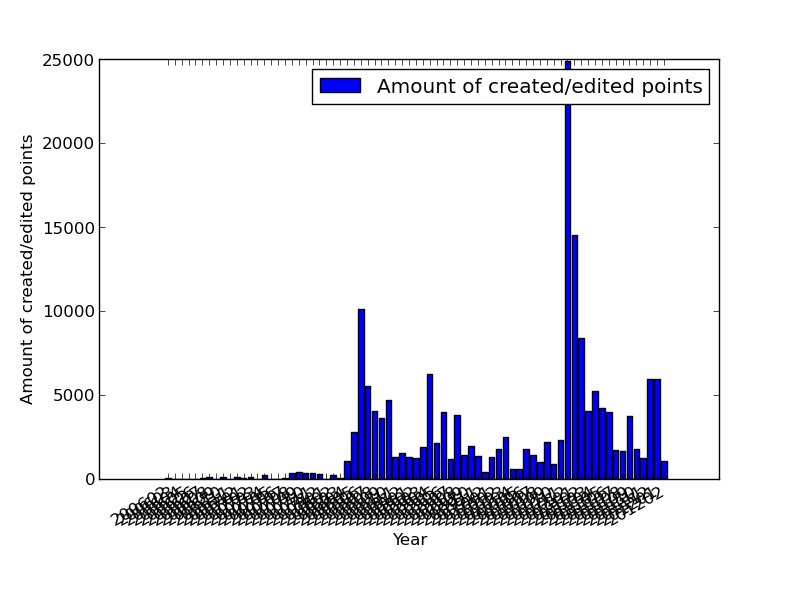
I’m generating a bar-chart with matplotlib. It all works well but I can’t figure out how to prevent the labels of the x-axis from overlapping each other. Here an example:
I have a dataframe that looks like this:
I am generating bar plots using matplotlib and it looks like there is a bug with the stacked bar plot. The sum for each vertical stack should be 100. However, for X-AXIS ticks 65, 70, 75 and 80 we get completely arbitrary results which do not make any sense. I do not understand what the problem is. Please find the MWE below.
I am using the following code to plot a bar-chart:
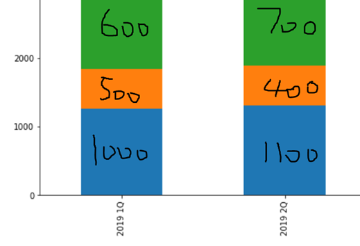
The goal here is to create a grouped bar plot, not subplots like the image below
I have dataframe like this: