How can I rotate xticklabels in matplotlib so that the spacing between each xticklabel is equal?
How can I rotate xticklabels in matplotlib so that the spacing between each xticklabel is equal?
How can I rotate xticklabels in matplotlib so that the spacing between each xticklabel is equal?
I am generating 2D heat map plots of a set of 3D data. I would like to be able to have a mechanism to interactively page through each pane. Below is a simple sample code, I would like to be able to interactively view both panes (ie, z = [0,1]) via a slider bar (or some other means). Is this possible with matplotlib or is this something I’ll need to do post processing after generating the image files?
I’m plotting two datasets with different units on the y-axis. Is there a way to make the ticks and gridlines aligned on both y-axes?
I am new to python and am trying to plot multiple lines in the same figure using matplotlib.
The value of my Y-axis is stored in a dictionary and I make corresponding values in X-axis in the following code
I have a dataframe that looks like the following
I am playing in Python a bit again, and I found a neat book with examples. One of the examples is to plot some data. I have a .txt file with two columns and I have the data. I plotted the data just fine, but in the exercise it says: Modify your program further to calculate and plot the running average of the data, defined by:
I need to recreate a chart similar to the one below created in Excel. I was hoping to use matplotlib, but can’t seem to find any examples or reference for how to do a chart like this. I need to have bars colored based on a performance threshold, and also display the threshold. Can anyone point me in the right direction? I do need to be able to do this with Python, though.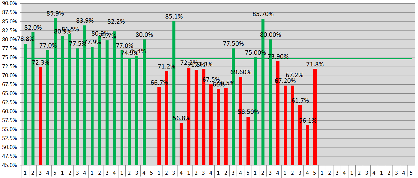
I want to plot data using Matplotlib via a colormap on the surface of a sphere. Additionally, I would like to add a 3D line plot. The code I have so far is this:
I am generating bar plots using matplotlib and it looks like there is a bug with the stacked bar plot. The sum for each vertical stack should be 100. However, for X-AXIS ticks 65, 70, 75 and 80 we get completely arbitrary results which do not make any sense. I do not understand what the problem is. Please find the MWE below.
I want to to create a figure using matplotlib where I can explicitly specify the size of the axes, i.e. I want to set the width and height of the axes bbox.