data-visualization
Place StripeLine On Top of Series (Adjust Z-Index/Z-Order)
I’m building a Column chart with System.Web.UI.DataVisualization.Charting and would like to show a dotted line to represent an average. StripeLine seems to be exactly what I’m looking for except it sits under/behind the columns (see example).
How to make IPython notebook matplotlib plot inline
I am trying to use IPython notebook on MacOS X with Python 2.7.2 and IPython 1.1.0.
How do I convert a numpy array to (and display) an image?
I have created an array thusly:
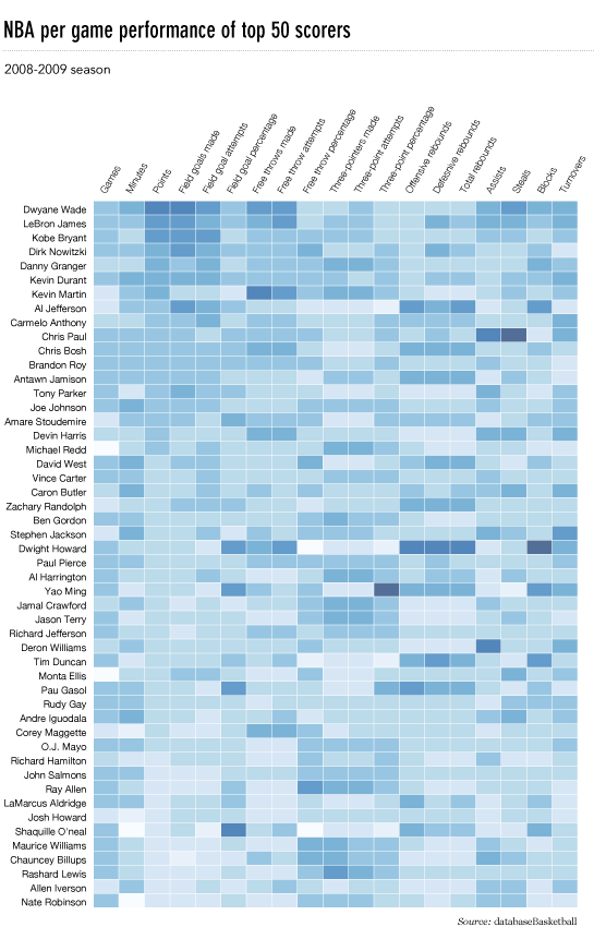
Heatmap in matplotlib with pcolor?
I’d like to make a heatmap like this (shown on FlowingData):
seaborn is not plotting within defined subplots
I am trying to plot two displots side by side with this code
Moving x-axis to the top of a plot in matplotlib
Based on this question about heatmaps in matplotlib, I wanted to move the x-axis titles to the top of the plot.
Use index in pandas to plot data
I have a pandas-Dataframe and use resample() to calculate means (e.g. daily or monthly means).
Here is a small example.
Plot correlation matrix using pandas
I have a data set with huge number of features, so analysing the correlation matrix has become very difficult. I want to plot a correlation matrix which we get using dataframe.corr() function from pandas library. Is there any built-in function provided by the pandas library to plot this matrix?
Seaborn: countplot() with frequencies
I have a Pandas DataFrame with a column called “AXLES”, which can take an integer value between 3-12. I am trying to use Seaborn’s countplot() option to achieve the following plot: